Threads of Hope Hellas
Threads of Hope Hellas is a not-for-profit organisation based in Greece that supports women after having experienced exploitation and abuse. Part of their business involves selling home and lifestyle products on their Shopify webshop, where each product has been sewn by a woman through the organisation’s training program.
Client
Area
Year
Tools
Note: Threads of Hope Hellas has since undergone a further redesign. The screenshots below reflect the work completed during this project in 2023.
The problem
At the beginning of my time volunteering with Threads of Hope Hellas in January of 2023, their web shop was experiencing a high drop-off rate as well as very few returning customers. Their webshop was losing visitors before they had a chance to engage with the products or the organisation's story.
Since their income from the webshop directly supports the organisation, every user who left without purchasing was a missed opportunity to support the program.
The goal was to redesign the webshop to reduce drop-off, encourage browsing, and make the shopping experience feel more trustworthy and approachable.
Research & problem identification
To be able to redesign, I first had to understand what was driving users away.
First, I conducted a thorough audit of the live Shopify site, going through it as a user would. This included browsing categories, reading product listings, and navigating the full purchase flow. This surfaced several friction points that, individually, might seem minor but together created a frustrating experience.
At the same time, I researched external literature on e-commerce drop-off rates to understand what factors most commonly cause users to abandon a webshop. This gave me a framework to contextualise what I was seeing on the site, and helped me prioritise which issues were worth addressing first.
I then brought these findings to the client directly. Rather than presenting a list of problems, I walked through what I had found and opened a conversation about which issues resonated with what they had already considered. Three core problems emerged:
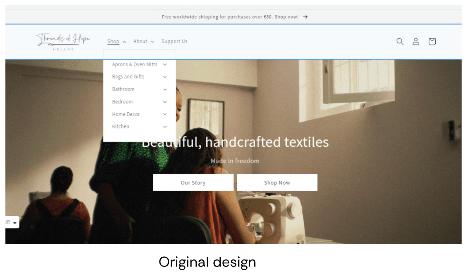
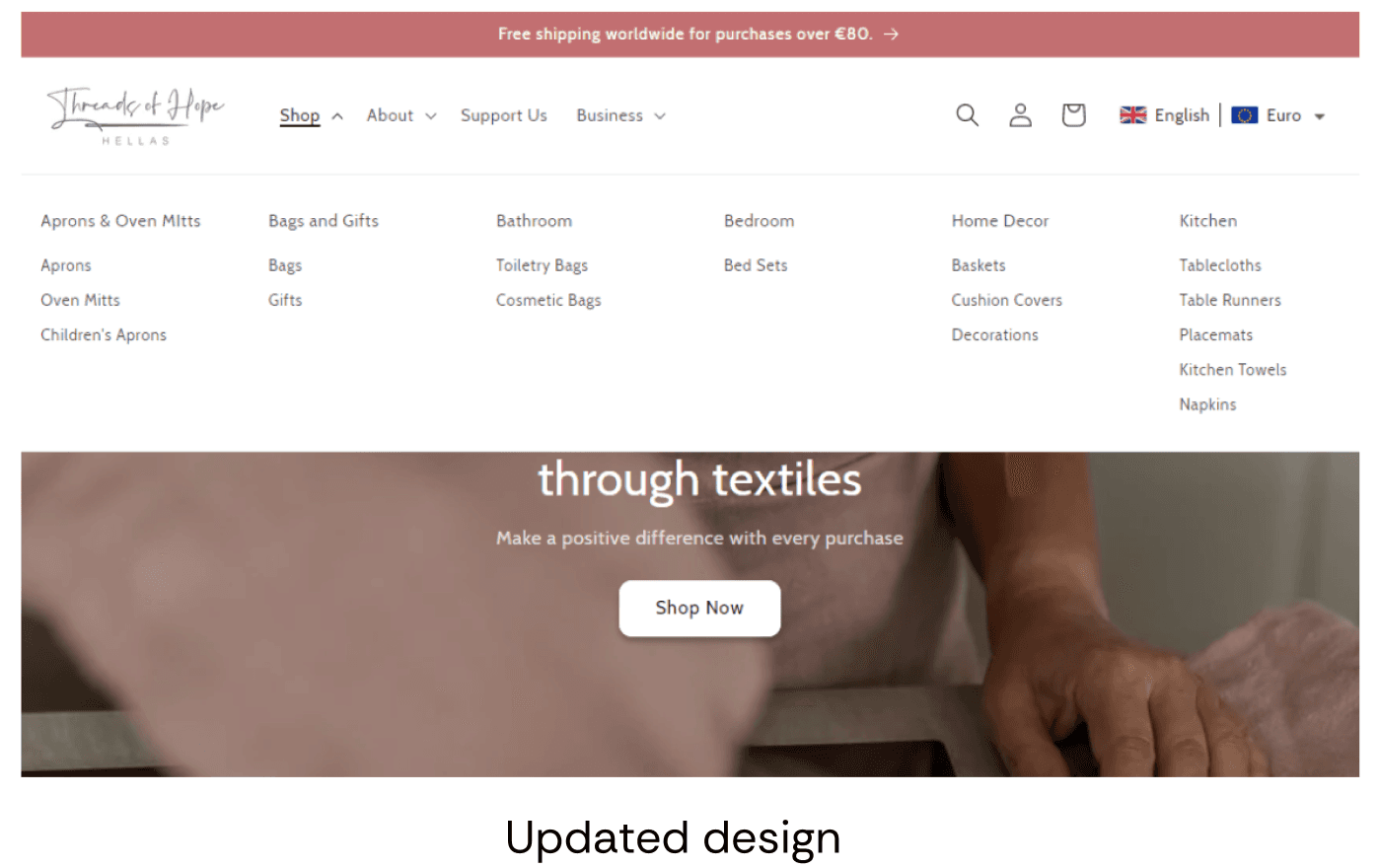
Unclear product categories - products were difficult to find, making it hard for users to build a sense of what the shop offered
Grammatical and spelling errors - these damaged credibility and trust
Long, inconsistent product names - confusing and visually cluttered in a shop environment
These became the foundation for the redesign brief.
Collaborative process
This project was built on a close working relationship with the client. Throughout the redesign, we held regular meetings over Zoom where I would present progress, share new directions, and gather feedback before moving forward.
The client had a clear sense of what they envisioned for the company, wanting a design that felt more feminine while still remaining professional. I was able to contribute my UX, translating ideas into specific design decisions.
This back-and-forth meant that every significant change went through a feedback loop, and the final result reflected both the client's knowledge of their audience and the UX thinking I applied to the structure and experience.
Design decisions
Visual language
Taking the client's direction for a softer, more feminine aesthetic into consideration, I made the following changes:
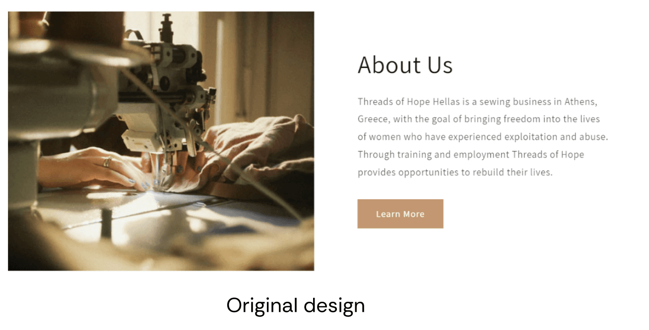
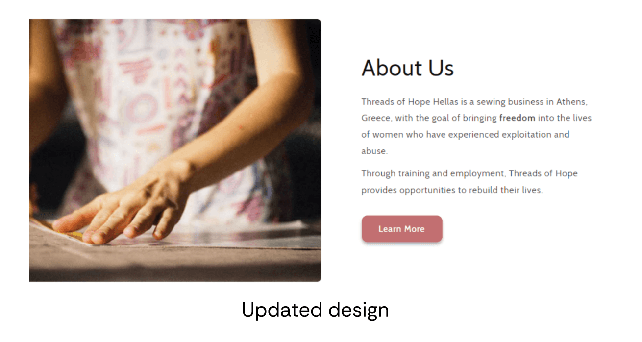
Colour: The primary colour was adjusted from a warm taupe to a deeper rose tone. The shift results in a warmer but still professional feel.
Shape: Button edges and image frames were given rounded corners, with soft shadows added. These changes reduce the visual sharpness of the interface and create a gentler, more inviting feel.
Typography: The typeface was changed from Assistant to Cabin. a This brought a slight warmth to the reading experience without sacrificing legibility.
Navigation & functionality
Addressing the core usability issues required changes to how the shop was structured, not just how it looked.
Product categories were subdivided into clearer subcategories, making it easier for users to find what they are looking for, in fewer steps.
Navigation menu changed from a dropdown to a mega menu, so all categories are visible at once. This gives users an immediate overview of everything the shop offers.
Outcome
Following the redesign, the client reported a more user-friendly webshop that aligned more with their goals for the organisation.
For me, this was also a great learning experience. Working within the constraints of an existing Shopify theme meant I couldn't redesign from a blank slate, every decision had to be achievable within the platform.
The regular client collaboration meant I could listen carefully, translate Threads of Hope's goals into something that served their users, and bring knowledge where it was needed.